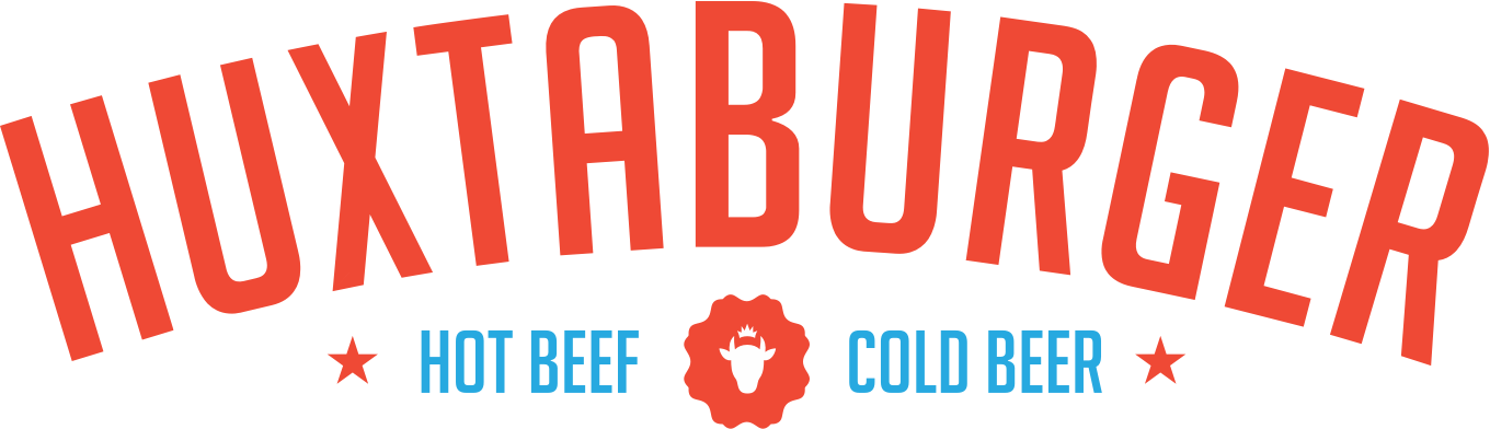
Bitcoins.com

We worked with a major bitcoin exchange, on a site to explain the complexities of Bitcoin.

Bitcoins.com

01

Watch the Video

Working with Marty Cook and WeDoVideo Tokyo, we put together a lighthearted visual explanation of Bitcoin intended to be played on a loop, without sound.

In 2 Minutes

02

A Simpler Mark

We perhaps over-reach to create an alternate version of the rather ugly Bitcoin mark which was not very established at the time, wanting something cleaner and clearer. Suffice to say, it never really took off. Consider it lesson learned.

Mark

03

Countering Stereotypes

At the time Bitcoin was thought of as the currency of choice for the underworld — never mind this was pretty inaccurate (cash is far less traceable than Bitcoin), countering it was one aim of the site, and so we went with a simple, clear and friendly approach, as if a knowledgeable friend was explaining it to you over a beer.

Bitcoins.com
Bitcoins.com

04

Visualising Metaphors

As with many technologies, many people struggle with the abstract concepts at their heart, so we aimed to give people some understanding of Bitcoin at a metaphorical level through the many illustrations we used through the site.

05

Japanese Wallet Prototype

We also named, designed and created a detailed prototype for a simple, social bitcoin wallet for the Japanese market, called Bitpocket.

Japanese Wallet Prototype

06

Credits•Visit the Site

  • Matt Innes Brand, Direction, Design
  • Ben Jennings Design, Code
  • David Hauser Code
  • Marty Cook Illustration
Next Project
Huxtaburger

Cobalt

Cobalt is an app security startup in San Francisco. We helped them with a brand and site.

Cobalt

01

Crowd Powered

Cobalt started life as Crowdcurity, as the name suggests, a crowdsourced web-app security testing startup in San Francisco, run by a great team of Danish Vikings. We helped with a new name, an eyeball / combination lock-inspired mark, and an approachable brand wrapped around it all.

Cobalt

02

Aiming for Clarity

With the site, we aimed to make their range of services clear, simple and accessible, with a friendly voice. We also did a brief UI pass over Central, their web dashboard, to clean it up.

Clarity

03

Bugs Categorised

As a big part of the site is the leaderboards for their security testers, where they get ranked against their peers, we worked with illustrator Marty Cook to create a range of icons representing all the bug types they can fix in client's applications — from access control to an SQL injection.

Bug
Bug
Bug
Bug
Bug
Bug
Bug
Bug
Bug
Bug
Bug
Bug

04

Credits•Visit the Site

  • Matt Innes Brand, Direction, Design
  • Saori Kajiwara Design, Illustration
  • Lars Kluge Inkpad CMS
  • Mariusz Roliński Front End Code
  • Marty Cook Illustration
Next Project
Hive

Hive

Hive approached us for a brand refresh and UI for their web and iOS Bitcoin wallets.

Hive

01

Hex Wild

Hive was a good brand to build on as they already had a great name, they just needed a more flexible mark, some consistency across their communication, and stronger typography. We started with the hex structure from honeycomb and created a new mark plus a range of geometric avatars for the app and site.

Icons

02

Hive Wallet 1.0

The idea behind Hive Web and Hive for iOS was to make an easy to use, secure wallet for retail bitcoin – paying in stores or sending to friends. We created a new way to find other users around you wirelessly, called Waggle, after the way bees move their bodies to guide other bees.

Wallet
Wallet
Wallet
Wallet
Wallet v1Wallet v1Wallet v1Wallet v1

03

Hive Wallet 2.0

Hive 1.0 was a great if you held just Bitcoin, but after we added Litecoin it became clear it wouldn’t scale well to many tokens. So we redesigned it to accomodate a whole portfolio of tokens, with a tile UI, live search, and external app integrations to bring other services like price tickers and instant trading. In the process we also made it visually lighter.

04

Hive Hosted

Though it never got off the ground, we also designed a white label wallet system for Hive, along with a back end dashboard for clients to manage their wallet, get notifications, and real time analytics.

Hive Hosted

05

Credits

  • Matt Innes Brand, Direction, Design
  • Saori Kajiwara UI/UX Design
  • Ben Jennings Design, Front end code
  • David Hauser Front end code
  • Wei Lu Back end code
  • Matt Lenz iOS version
Next Project
Bitcoins.com

Huxtaburger

We designed the original brand, site and print work, and have been happy to see them grow into the Melbourne icon they are today.

Huxtaburger

01

Milk Bar vs Diner

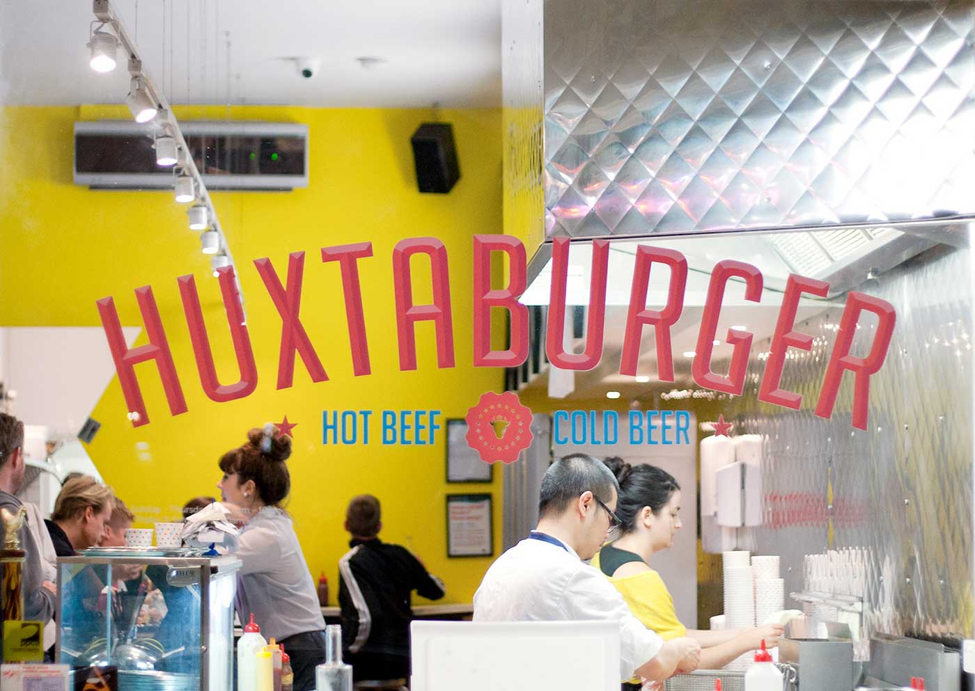
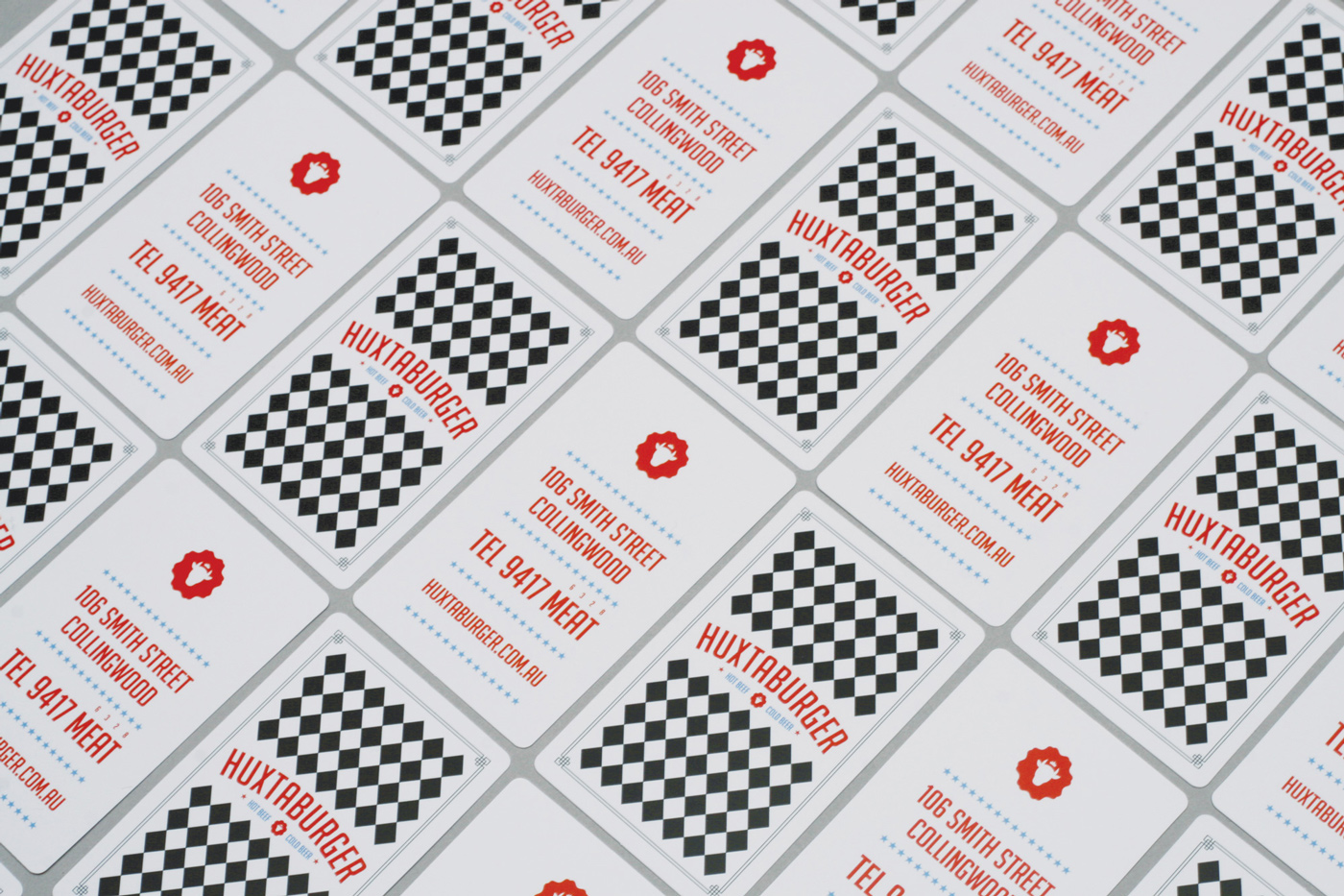
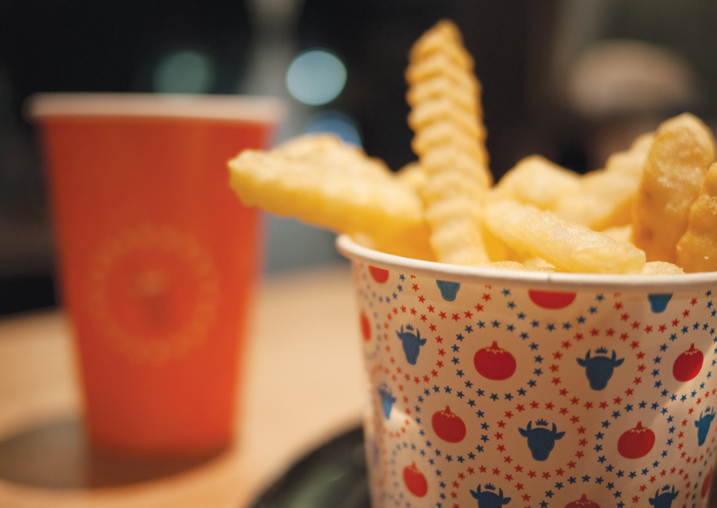
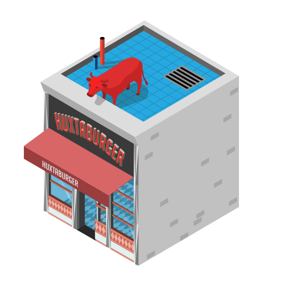
One of the first players in the now-crowded gourmet burger scene, the original brand is a mashup of classic American diner with a 70’s Aussie milk bar typographic aesthetic — pressed metal diamonds meets red, white & blue fly strips, with the king of beef at the centre of it all.

02

Beery Browsing

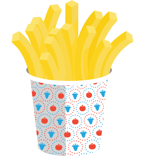
The key UX concept that drove the site design was simple. Users should be be able to flip through the site on a phone with one hand while holding a beer in the other. Also, early on, we decided we want to be able to see what was in the burgers by tapping them. Put another way, exploding burgers.

03

Making an Icon iconic

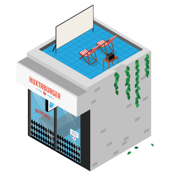
It was an uphill battle to convince the client that we should illustrate all their burgers and products. Lots of people do it now, but at the time it was relatively rare. It worked well, and customers love it. Once we’d applied it to the products we extended it to the stores, making each one an individual animated icon. Try tappingclicking the ones below.

Tap!
Tap!
Tap!
Tap!
Tap!
Tap!

04

Sexy Neon

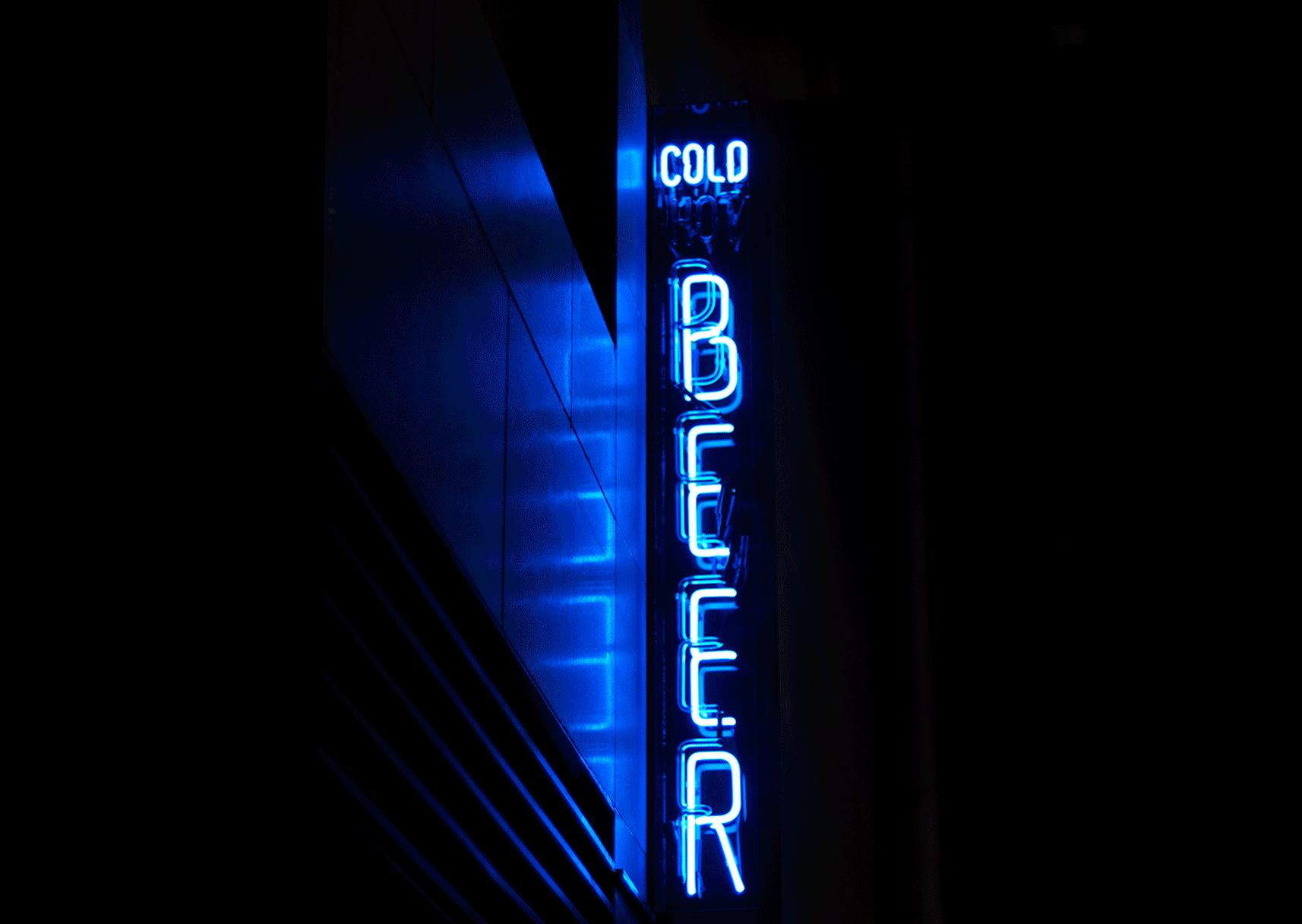
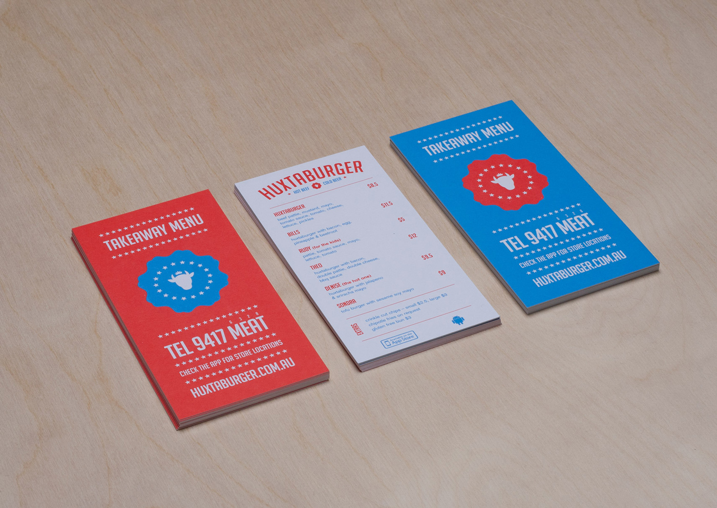
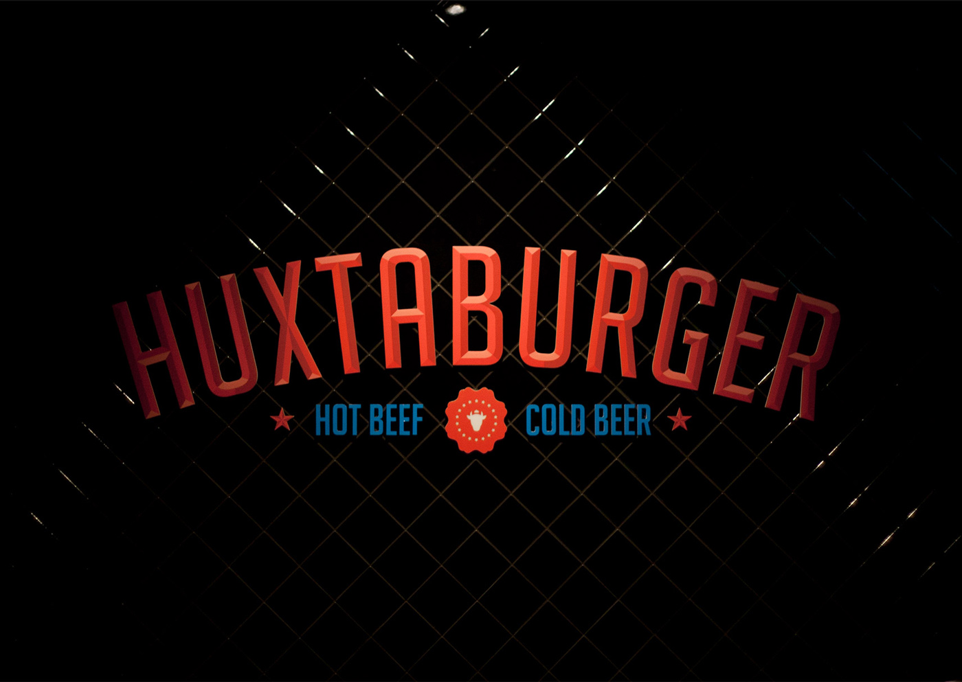
We put together a wide range of signage including windows, and boxes but without doubt this Hot Beef — Cold Beer neon is our favourite.

05

Credits•Visit the Site

  • Matt Innes Brand, Direction, Design
  • Ben Jennings Design, Code
  • David Hauser Code
  • Mariusz Roliński Code
  • Marty Cook & Saori Kajiwara Illustration
Next Project
Golem

Inkpad

Inkpad is a lightweight publishing platform we made with Lars and Mariusz from Tsunagari.

Inkpad

01

Simple Text

The idea for Inkpad was fairly simple – an elegant way to be able to write, share and publish simple text documents to the web, via a Markdown-flavoured editor. As we used it more and more, we designed and built an online file system to keep track of all your own, and your shared pads.

Simple Text

02

Edit + Publish

Inkpad has 2 main work views. Edit for writing, editing and formatting with Markdown – and HTML if you like. Display renders your document as an elegantly formatted HTML document ready for sharing. You can lock your pad, or allow anyone else to edit it.

03

Mobile Views

The mobile views haven’t all made their way to code yet, but the idea is, as with the desktop views, to keep it as simple as possible, with the app just getting out of your way and allowing you to easily write and collect your documents on your phone.

Inkpad
Inkpad
Inkpad
Inkpad
InkpadInkpadInkpadInkpad

07

Credits•Visit the Site

  • Matt Innes Brand, Direction, Design
  • Saori Kajiwara Design, Illustration
  • Lars Kluge Inkpad CMS
  • Mariusz Roliński Code
Next Project
Cobalt

Idealogue

We work with startups to create great digital products we believe in.

  • Projects

    • Golem
    • Vizor
    • Inkpad
    • Bitcoins.com
    • Cobalt
    • Hive
    • Huxtaburger

  • Team

    • Matt Innes
    • Saori Kajiwara

  • More

    • Email us
    • Behance
Build by Mariusz•That’s it! Thanks for coming by 👍
Build by M•That's all there is. 👍

Idealogue

  • Projects

    • Golem
    • Vizor
    • Inkpad
    • Bitcoins.com
    • Cobalt
    • Hive
    • Huxtaburger

  • Team

    • Matt Innes
    • Saori Kajiwara

  • More

    • Email us
    • Behance
Matt Innes
Designer/Creative Director

Matt has worked as a designer and creative director in Australia and Japan for more than 10 years. His work has been featured in a range of publications on & offline. He holds a degree in Communication Design from Swinburne School of Design, Melbourne. He loves type, simple bikes & custom motorbikes. He is a firm but not wild-eyed believer in the utility and future of digital currency.

TwitterInstagramBehance
Saori
Saori Kajiwara
UI/UX Designer

A native of Shizuoka, Japan, Saori holds a degree in Communication Design from Swinburne Design School, Melbourne. She has worked as an illustrator and designer in Melbourne and Tokyo.

One of her projects, Email-san, was acquired by Google Japan. She has been a regular contributor to Tokyo digital culture magazine Brain. She is most comfortable when building animations and prototypes with her toolkit of Sketch, Atomic, Principle and Pixate.

Matt
PinterestBehance
Matt

Vizor

Working with Helsinki-based startup Pixelface, we designed a powerful system for creating WebVR in the browser.

Vizor

01

From Engi.works to Vizor

The app we saw in mid-2015, then known as Engi, was very rough, but powerful. It had its own WebGL-based realtime 3D graphics engine, a ton of shaders and effects, the ability to output to stereo VR views, and a deep visual programming interface. We renamed it Vizor and created a new brand style for it.


02

Visual Programming

One of our first tasks was to clean up the programming UI. It could do almost anything, but was a confusing mess of tiny icons, unclear connections and hard to fathom structure. We introduced a colour scheme for patch types, accordions, clearer connections, and a consistent structure.

03

The Editor

The editor is a fast and fluid webGL-based 3D editor with switchable orbit & VR cameras and single-click to publish. We introduced a unique circular grid centred on the HMD icon, for easy VR composing around the viewer, as well as bold, highly visible icons for HMD and lights.

04

The Player

Content on Vizor ranges from 360 photos to immersive stories, infographics and visual experiments. The player was designed for simplicity across 2D and VR views on desktops and mobile.

05

The Platform

With a fully web-based file system, users needed to be able to have public and private views of their projects, along with drafts and public projects to keep things tidy. We prototyped and created this from the ground up, as it didn’t exist in the original prototype.

06

Editor Icons & Assets

Due to the need to keep polygon counts and file sizes down for a reasonable page load time, we worked with illustrator Jeremy Edelblut to develop a playful, low-poly style to use across 3D icons for the editor, as well as library assets for users to build with.

07

Credits•Visit the Site

  • Matt Innes Brand, Design Lead
  • Saori Kajiwara UI/UX design
  • Jeremy Edelblut 3D modeling
  • Kaarlo Kanninen Editor code
  • Jaakko Manninen Core code
  • Georgi Marinov Front end
Next Project
Inkpad

Golem

We worked on user experience design for the cryptocurrency-based shared computing project, as well as a brand that didn’t see the light of day.

Golem

01

User Experience First

On these type of projects we usually start with the brand process, in order to create a good toolkit and consistent voice to use in the product design, launch site and social media. In this case, the team wanted to do a user experience pass first, as they wanted to show some public progress, rather than waiting for a brand process to run its course.

User Experience First
The original Golem Alpha interface

One key problem to solve was that there would be two very distinct user types, Providers, who would run the app to earn digital tokens in return for their compute power, and Requesters who would pay to use the network to run tasks. Some of these users would do both, but many would not. This led to us dividing the UI for these groups. We explored these ideas with a number of wireframes and interaction prototypes.

Early Wireframes
Early wireframes for the Golem app

02

Simple Visual Design Pass

As we had not developed a brand yet, and the existing Golem brand was unsuitable, we developed the first visual pass as a fairly generic bootstrap type theme that we could build on. The toughest problem was really creating a system that could work for future unknown task types while also working well for the first integration, which was to be 3D rendering for Blender and LuxRender.

  • Network
  • Tasks
    • Wallet balance
    • Approximate wallet balance
    • Gas balance
    • Approximate gas balance
    • 10.35
    • $4.94
    • 0.025
    • $5.69
      • GNT
      • USD
      • ETH
      • USD
    Approximately 325 tx fees
    • Resources
    • History
    • Advanced
    • 18

      Use the slider to choose how much of your machine’s resources (CPU, RAM and disk space) Golem can use. More power means more potential income.

      • +0.014 GNT
        Processed Task
        1:15Pending
      • -0.017 GNT
        HMD Model Bake 3.5
        1:038:01AM 28 Feb
      • +0.015 GNT
        Processed Task
        2:158:01AM 28 Feb
      • +0.013 GNT
        Processed Task
        1:158:01AM 28 Feb
    • Custom
      Save as Preset
      CPU
      RAM
      Disk
      6 cores
      1.5 GB
      700 GB

      Allocate your machine’s resources exactly as you like. Remember that if you give Golem all of your processing power you will not be
able to use it at the same time.

    240 Nodes
    Start Golem
    • HMD Model Bake 3.5
      1:15 Remaining
      2:30Just now
    • Planet Scene Light vers
      1:23:153:15PM Yesterday
    • HMD Model Bake 3.4
      18:151:01PM 27 Feb
    • HMD Model Bake 3.3
      21:5111:12AM 24 Feb
    1 task in progress
A loop of the Golem app main views

The other key goal was to design something anyone could use, but also something that power users could customise to their liking. We had to push quite hard to keep the simple slide-to-allocate resources on the Network view, but balanced it out with an advanced setup for users comfortable with tweaking parameters.

03

Visual Identity

The core idea was to make something that could go beyond the usual cryptocurrency brand and appeal to a more mainstream audience. The interesting points for us were the stages of the project the whitepaper envisioned — Brass, Clay, Stone, Iron. Creating a brand that could vary and grow from stage to stage was the idea we started with. We also liked the origin of the name — Stanislav Lem’s novel Golem XIV, about a conversation with an AI which is evolving consciousness.

Visual Identity
Exploration and development for the Brass Golem character
GolemGolemGolem
Final Brass Golem character poses

We decided upon a character that would combine an AI and a traditional Golem, along with a flexible mark that could be animated to represent the network in some way. To that end we brought on illustrator Stuart Wade, whose work we’d admired on the Monster Project. The tricky part with the character development was to find something that was part AI, part golem, without being too robotic — and without feeling too threatening or overly cute. The reaction on Reddit to an early presentation was that we got that right.

Loop animation of the Brass Golem character
Mark Animated
Mark Animated
Mark Horizontal Lockup
Mark Vertical Lockup
Mark Animated
Mark Animated
Display Face
Realtime Text
ABCDEFGHIJKLMNOPQRSTUVWXYZ
abcdefghijklmnopqrstuvwxyz
1234567890 $£&
Mark Vertical Lockup
Headlines
Sharp Sans
ABCDEFGHIJKLMNOPQRSTUVWXYZ
abcdefghijklmnopqrstuvwxyz
1234567890 $£&
Mark Horizontal Lockup
UI & Body
Roboto
ABCDEFGHIJKLMNOPQRSTUVWXYZ
abcdefghijklmnopqrstuvwxyz
1234567890 $£&
Brass Stage Colours
  • #005DD5
  • #FFC442
  • #37C481
  • #B5B5B5
Shirt
Shirt
Shirt
Shirt
Shirt
Shirt
Reddit Page
A simple Reddit theme for the project

04

Beta Launch Page

The beta launch page was to be fairly simple, as the app itself was still under heavy development. So the focus was just on alerting people to the Brass milestone, providing download access and encouraging users to come and talk to us on Slack and Reddit about testing the beta, and rendering 3D files, the first Golem integration.

Beta Launch Page
Beta Launch Page

05

Credits

  • Matt Innes Brand, Design Lead
  • Saori Kajiwara UI/UX design
  • Stuart Wade Character design, animation
Next Project
Vizor