Golem
We worked on user experience design for the cryptocurrency-based shared computing project, as well as a brand that didn't see the light of day.

On these type of projects we usually start with the brand process, in order to create a good toolkit and consistent voice to use in the product design, launch site and social media. In this case, the team wanted to do a user experience pass first, as they wanted to show some public progress, rather than waiting for a brand process to run its course.
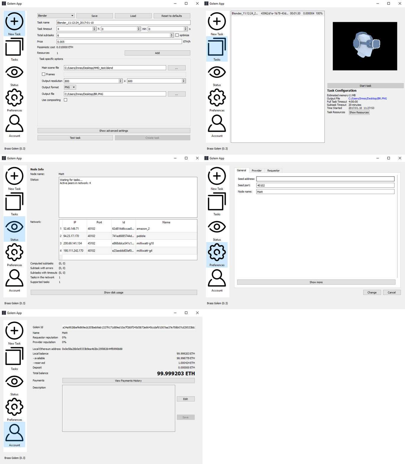
One key problem to solve was that there would be two very distinct user types, Providers, who would run the app to earn digital tokens in return for their compute power, and Requesters who would pay to use the network to run tasks. Some of these users would do both, but many would not. This led to us dividing the UI for these groups. We explored these ideas with a number of wireframes and interaction prototypes.
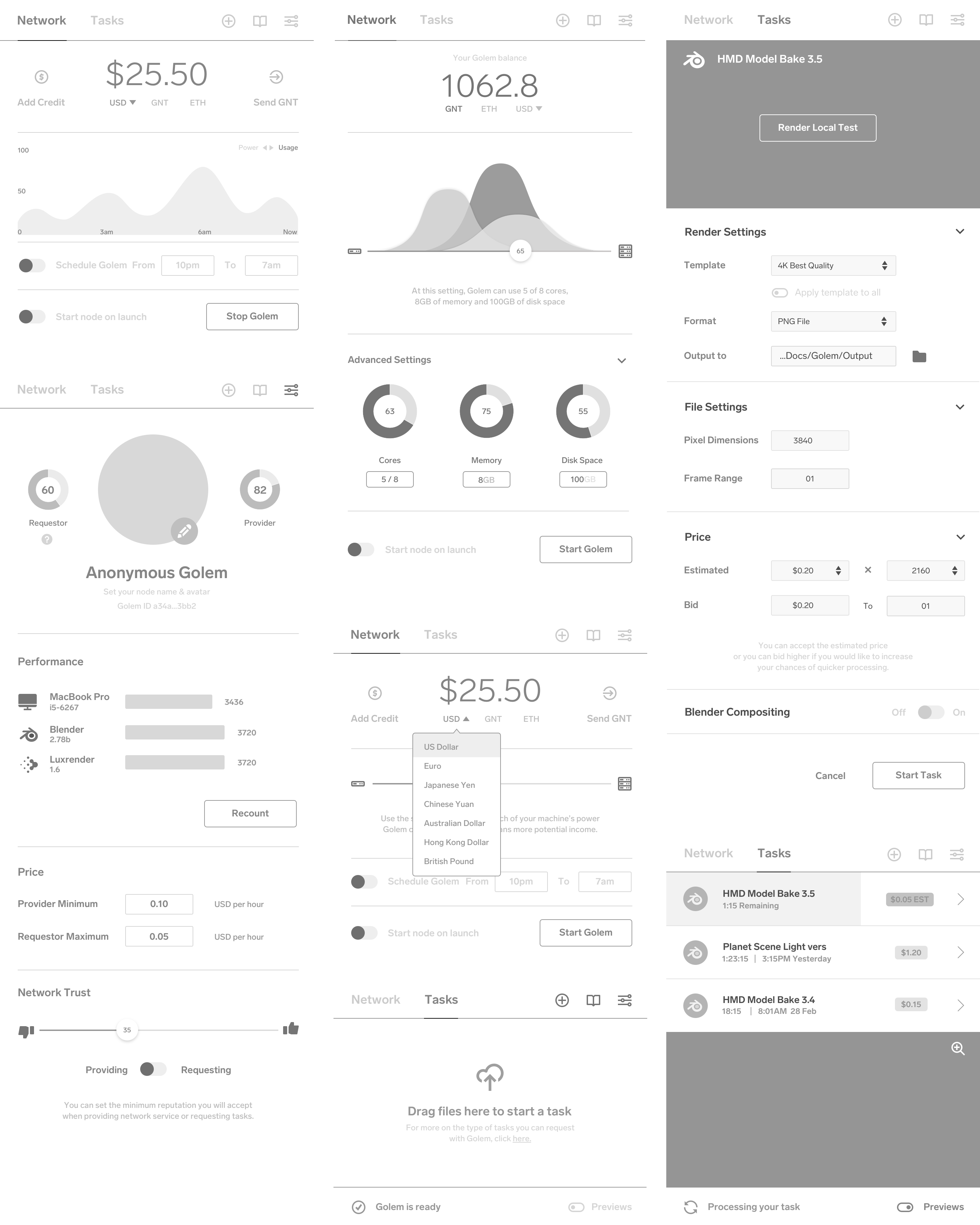
As we had not developed a brand yet, and the existing Golem brand was unsuitable, we developed the first visual pass as a fairly generic bootstrap type theme that we could build on. The toughest problem was really creating a system that could work for future unknown task types while also working well for the first integration, which was to be 3D rendering for Blender and LuxRender.
Use the slider to choose how much of your machine's resources (CPU, RAM and disk space) Golem can use. More power means more potential income.
Allocate your machine's resources exactly as you like. Remember that if you give Golem all of your processing power you will not be able to use it at the same time.
The other key goal was to design something anyone could use, but also something that power users could customise to their liking. We had to push quite hard to keep the simple slide-to-allocate resources on the Network view, but balanced it out with an advanced setup for users comfortable with tweaking parameters.
The core idea was to make something that could go beyond the usual cryptocurrency brand and appeal to a more mainstream audience. The interesting points for us were the stages of the project the whitepaper envisioned — Brass, Clay, Stone, Iron. Creating a brand that could vary and grow from stage to stage was the idea we started with. We also liked the origin of the name — Stanislav Lem's novel Golem XIV, about a conversation with an AI which is evolving consciousness.
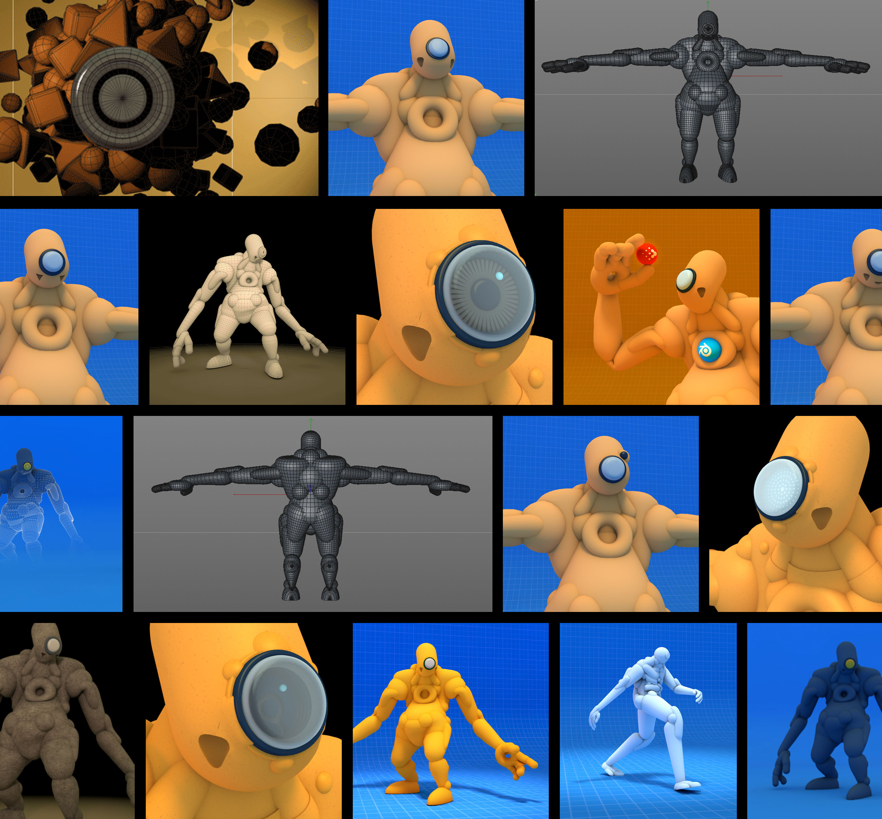
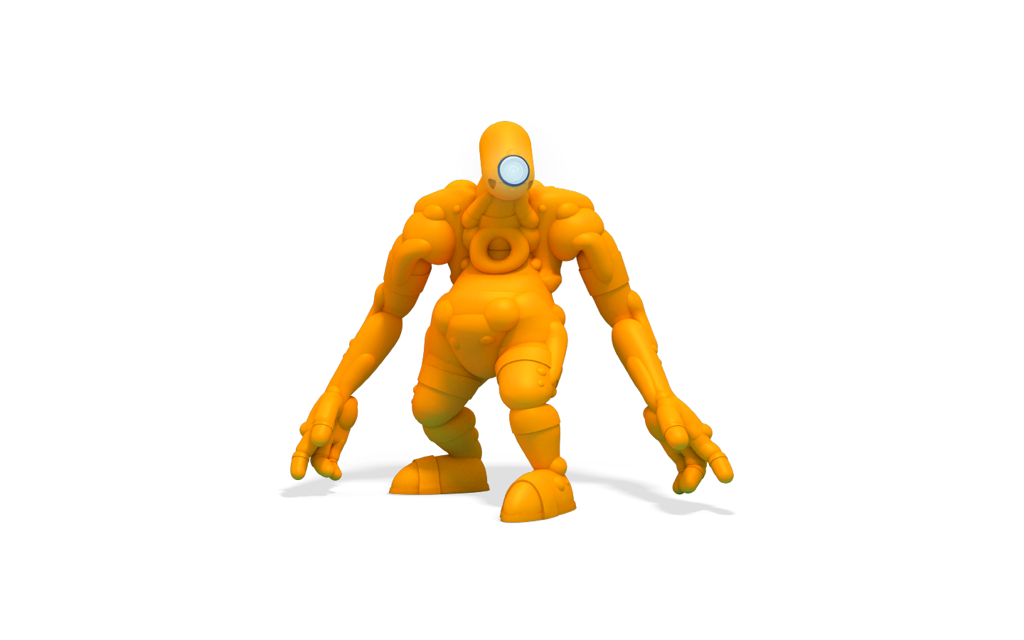
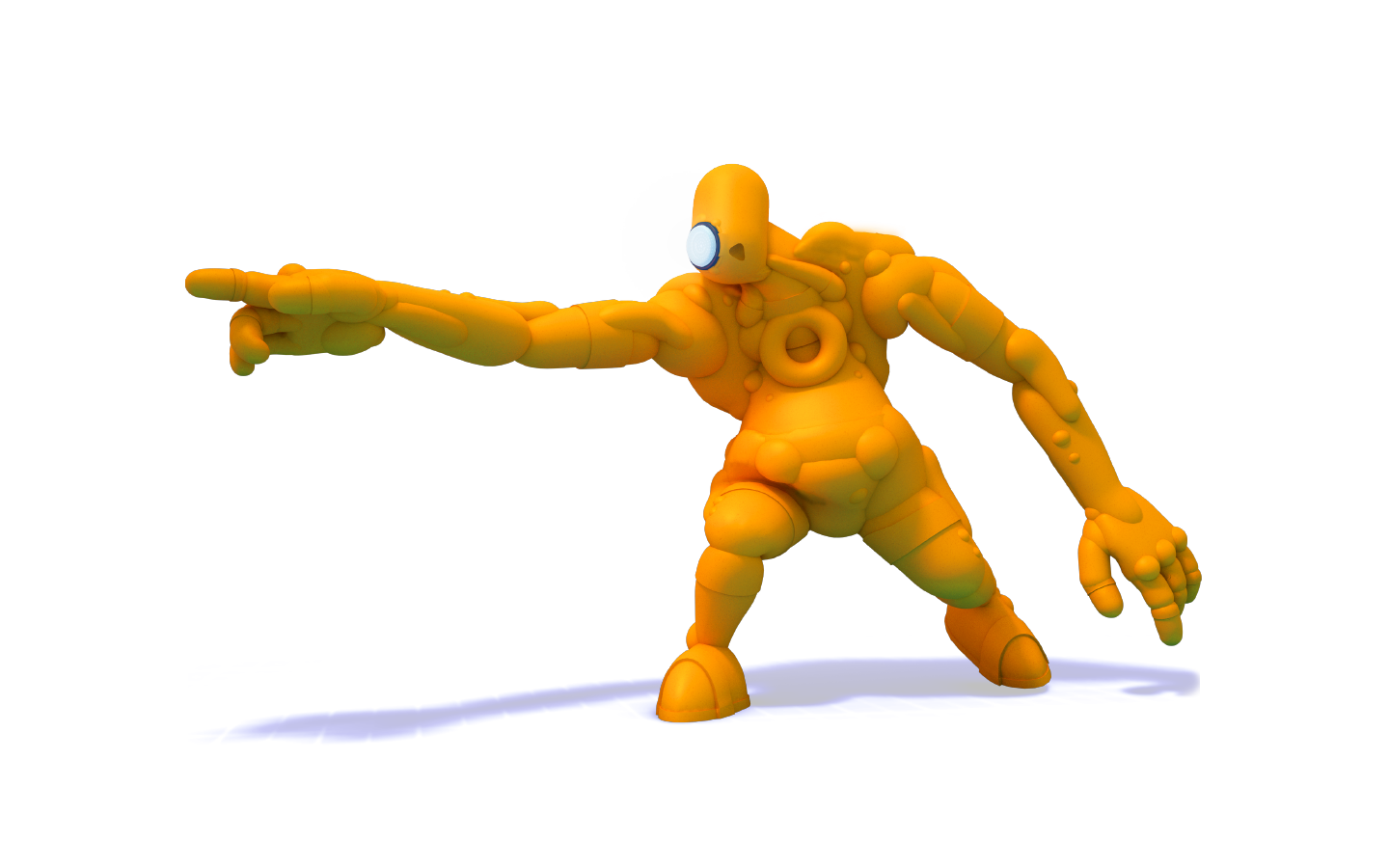
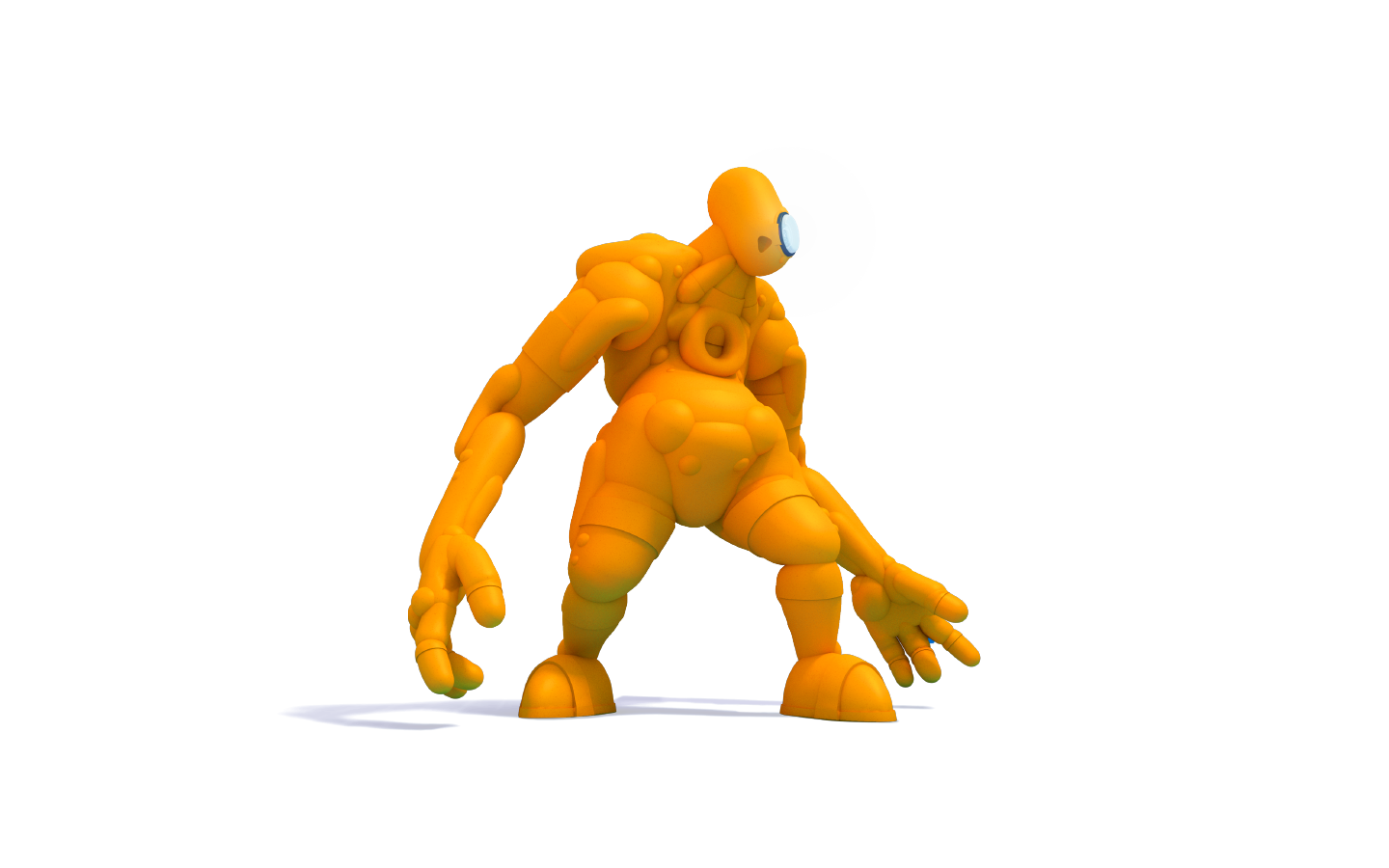
We decided upon a character that would combine an AI and a traditional Golem, along with a flexible mark that could be animated to represent the network in some way. To that end we brought on illustrator Stuart Wade, whose work we'd admired on the Monster Project. The tricky part with the character development was to find something that was part AI, part golem, without being too robotic — and without feeling too threatening or overly cute. The reaction on Reddit to an early presentation was that we got that right.

Realtime Text
ABCDEFGHIJKLMNOPQRSTUVWXYZ
abcdefghijklmnopqrstuvwxyz
1234567890 $£&

Sharp Sans
ABCDEFGHIJKLMNOPQRSTUVWXYZ
abcdefghijklmnopqrstuvwxyz
1234567890 $£&

Roboto
ABCDEFGHIJKLMNOPQRSTUVWXYZ
abcdefghijklmnopqrstuvwxyz
1234567890 $£&
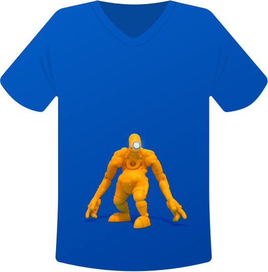
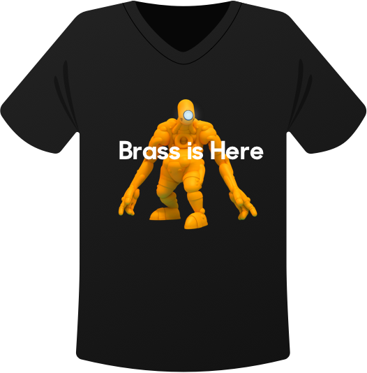
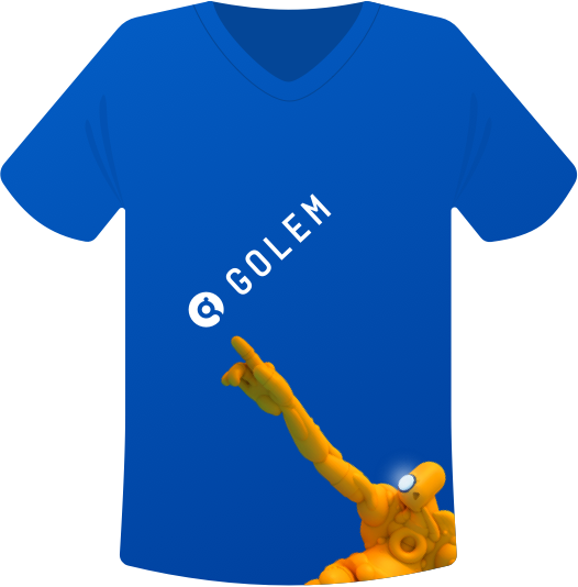
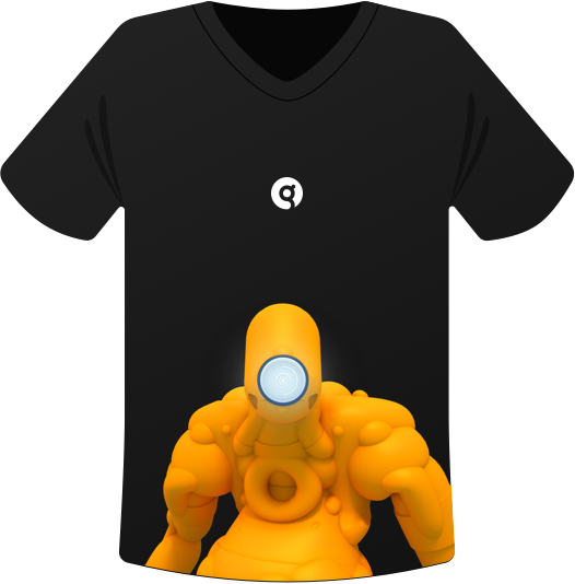
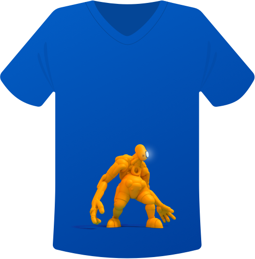
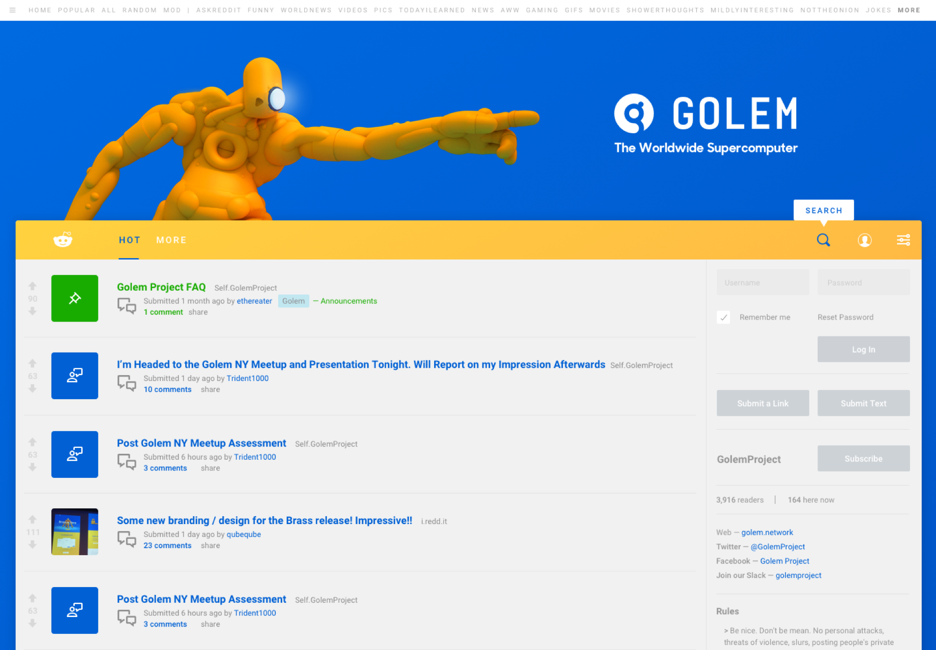
The beta launch page was to be fairly simple, as the app itself was still under heavy development. So the focus was just on alerting people to the Brass milestone, providing download access and encouraging users to come and talk to us on Slack and Reddit about testing the beta, and rendering 3D files, the first Golem integration.

