Hive
Hive approached us for a brand refresh and UI for their web and iOS Bitcoin wallets.

Hive was a good brand to build on as they already had a great name, they just needed a more flexible mark, some consistency across their communication, and stronger typography. We started with the hex structure from honeycomb and created a new mark plus a range of geometric avatars for the app and site.
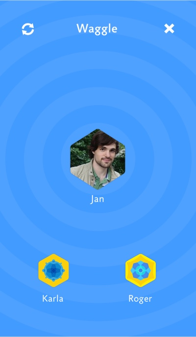
The idea behind Hive Web and Hive for iOS was to make an easy to use, secure wallet for retail bitcoin – paying in stores or sending to friends. We created a new way to find other users around you wirelessly, called Waggle, after the way bees move their bodies to guide other bees.
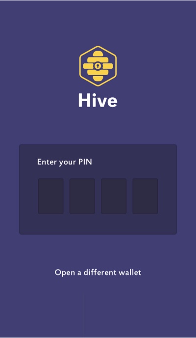

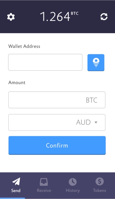
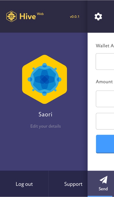


Hive 1.0 was a great if you held just Bitcoin, but after we added Litecoin it became clear it wouldn’t scale well to many tokens. So we redesigned it to accomodate a whole portfolio of tokens, with a tile UI, live search, and external app integrations to bring other services like price tickers and instant trading. In the process we also made it visually lighter.
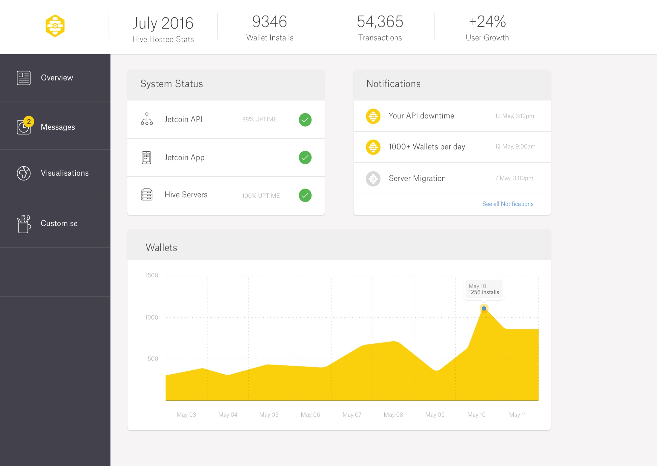
Though it never got off the ground, we also designed a white label wallet system for Hive, along with a back end dashboard for clients to manage their wallet, get notifications, and real time analytics.
